5 min read
Design Systems
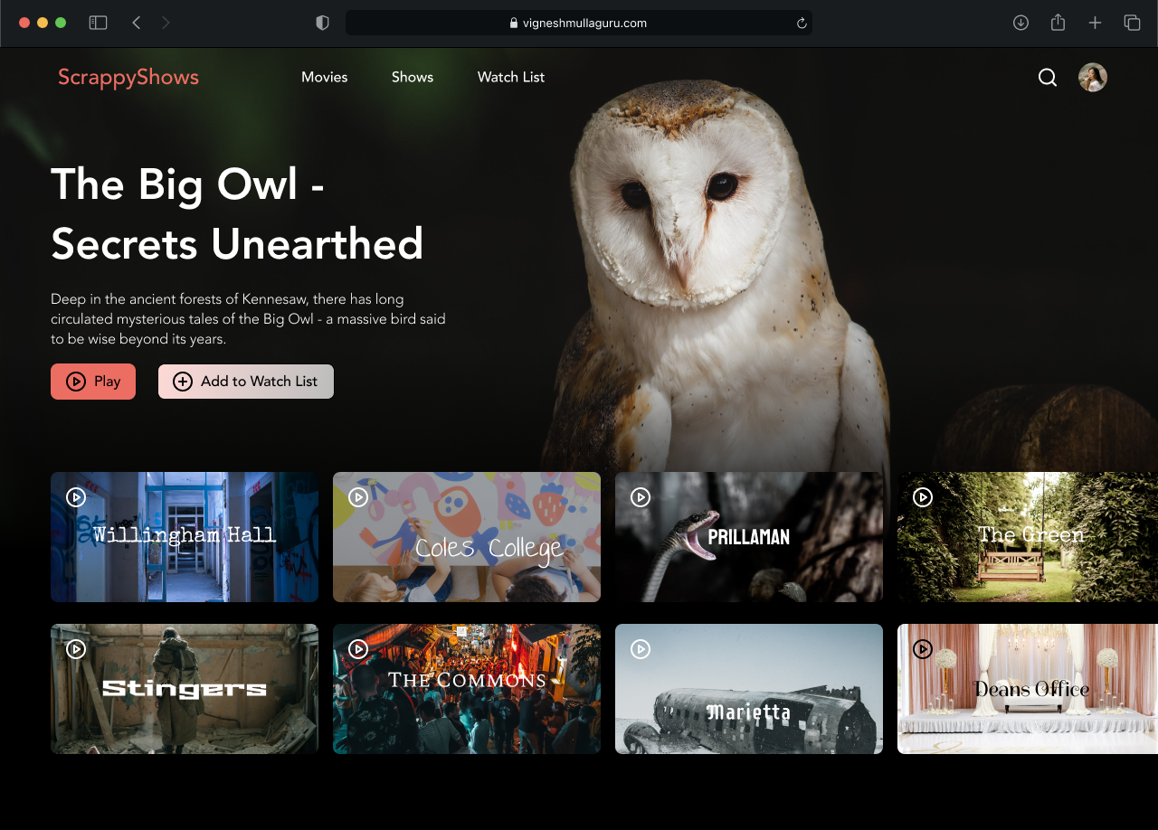
This page highlights my UI Design and advanced prototyping skills in Figma. The goal was to demonstrate aesthetic unity across the screen designs, leveraging different tools/skills in Figma.
My Role
UI Designer
Visual Designer
Prototyping
Tools
Figma
Adobe Illustrator
Team
Individual Project
Duration
3 weeks
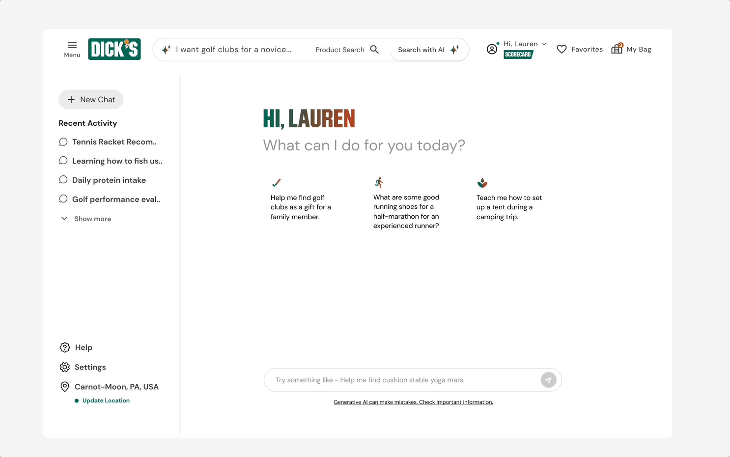
Project 1
Utilizing Variables
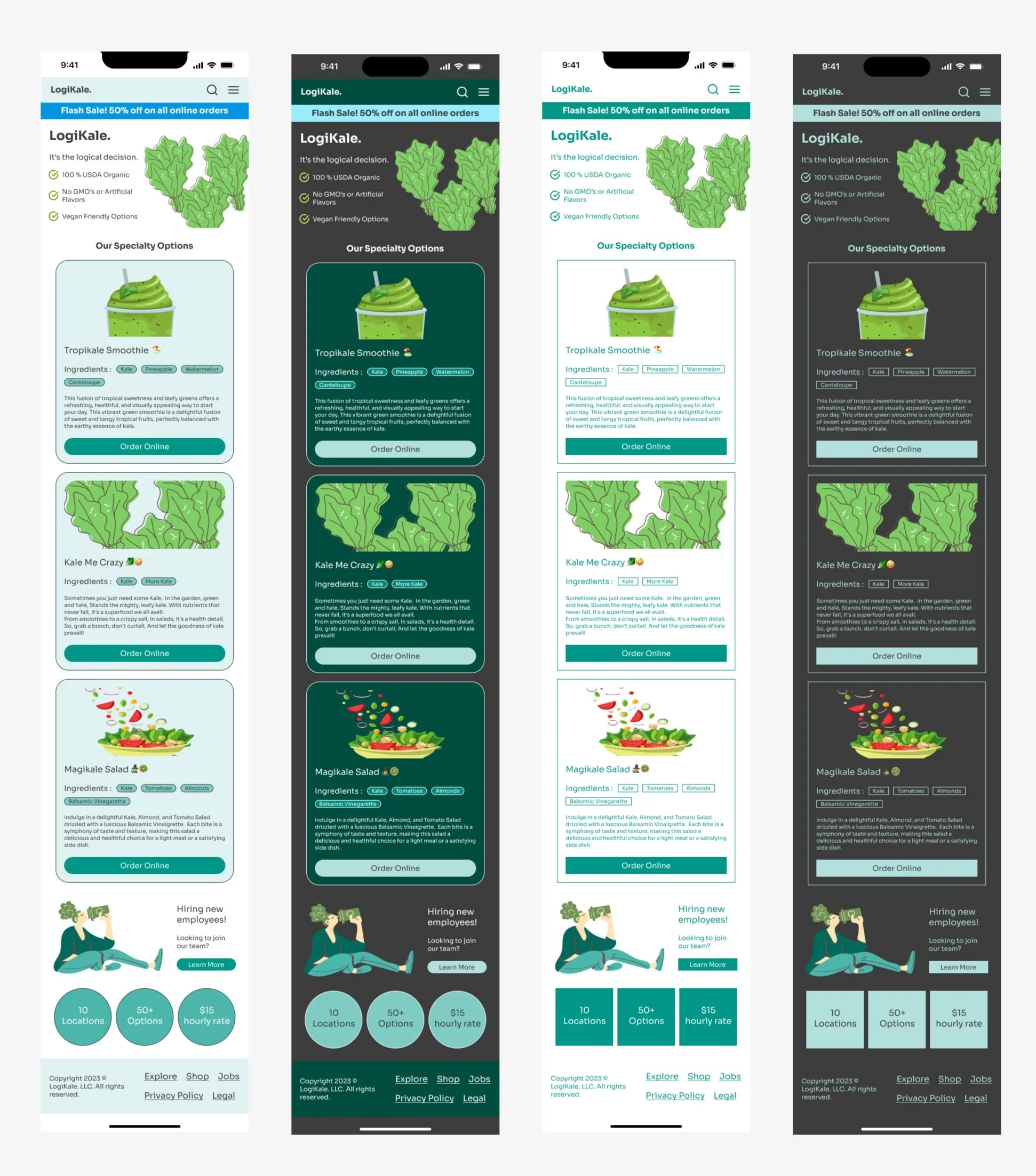
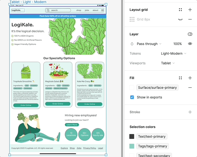
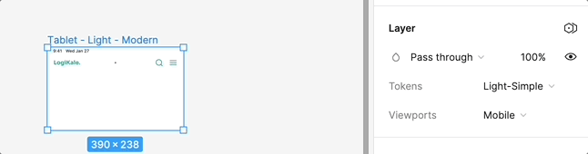
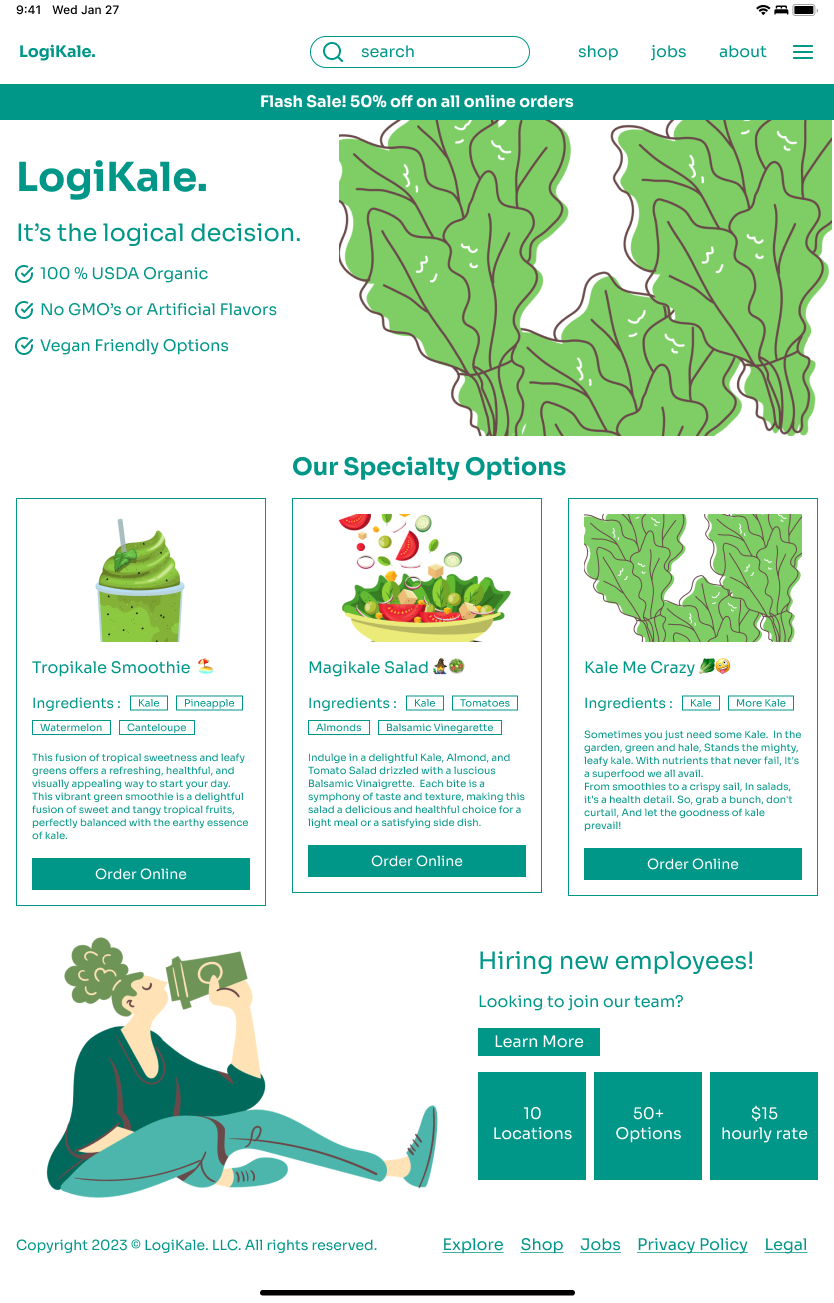
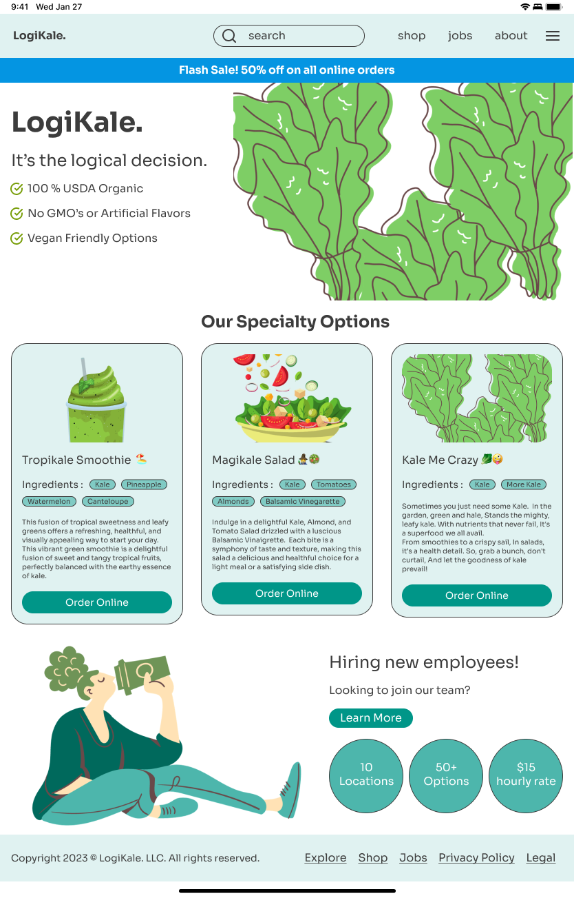
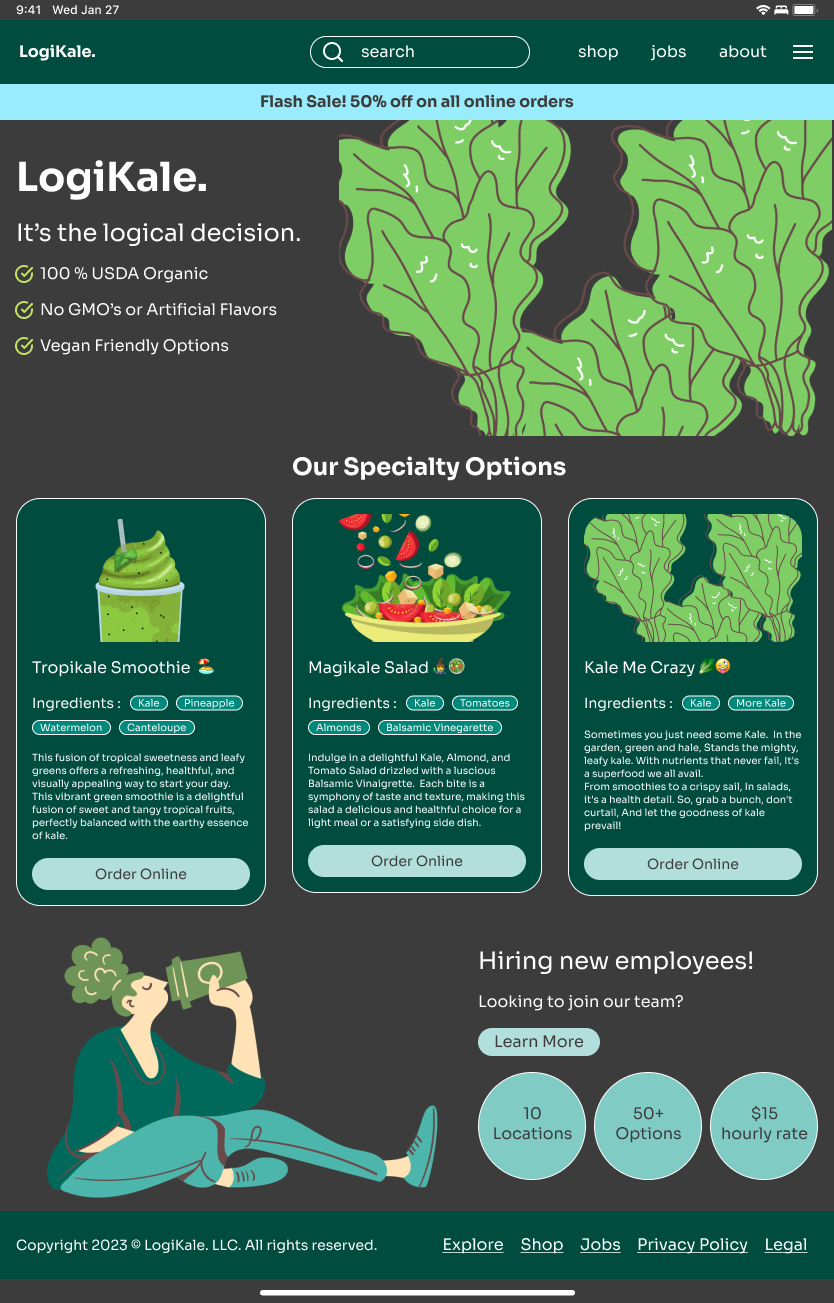
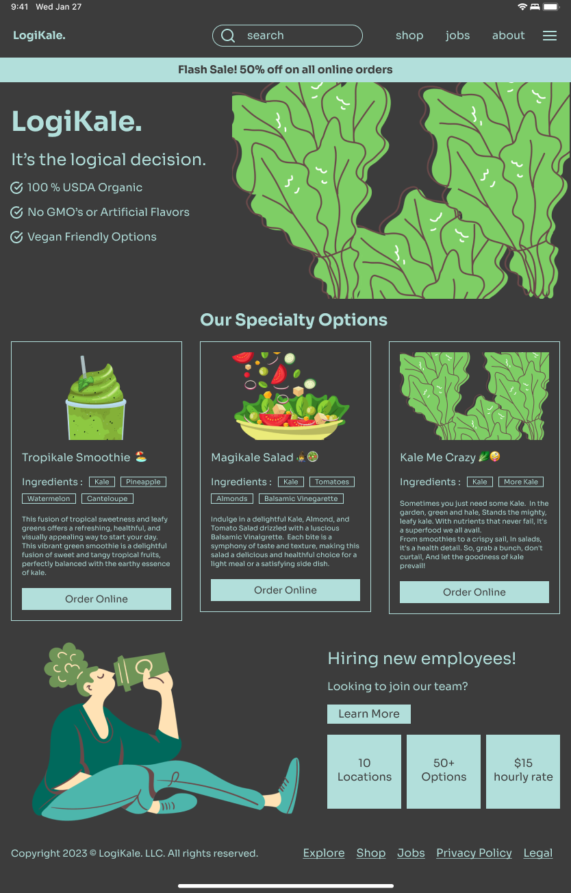
Utilizing Figma's variable system, I could make one standard design responsive to multiple screen sizes and changing modes, such as adding a dark and light mode. I also made a responsive tablet and mobile version for this project. All of these designs have components with auto layout properties and adhere to an 8-point grid system.
Consistency is key 🔑
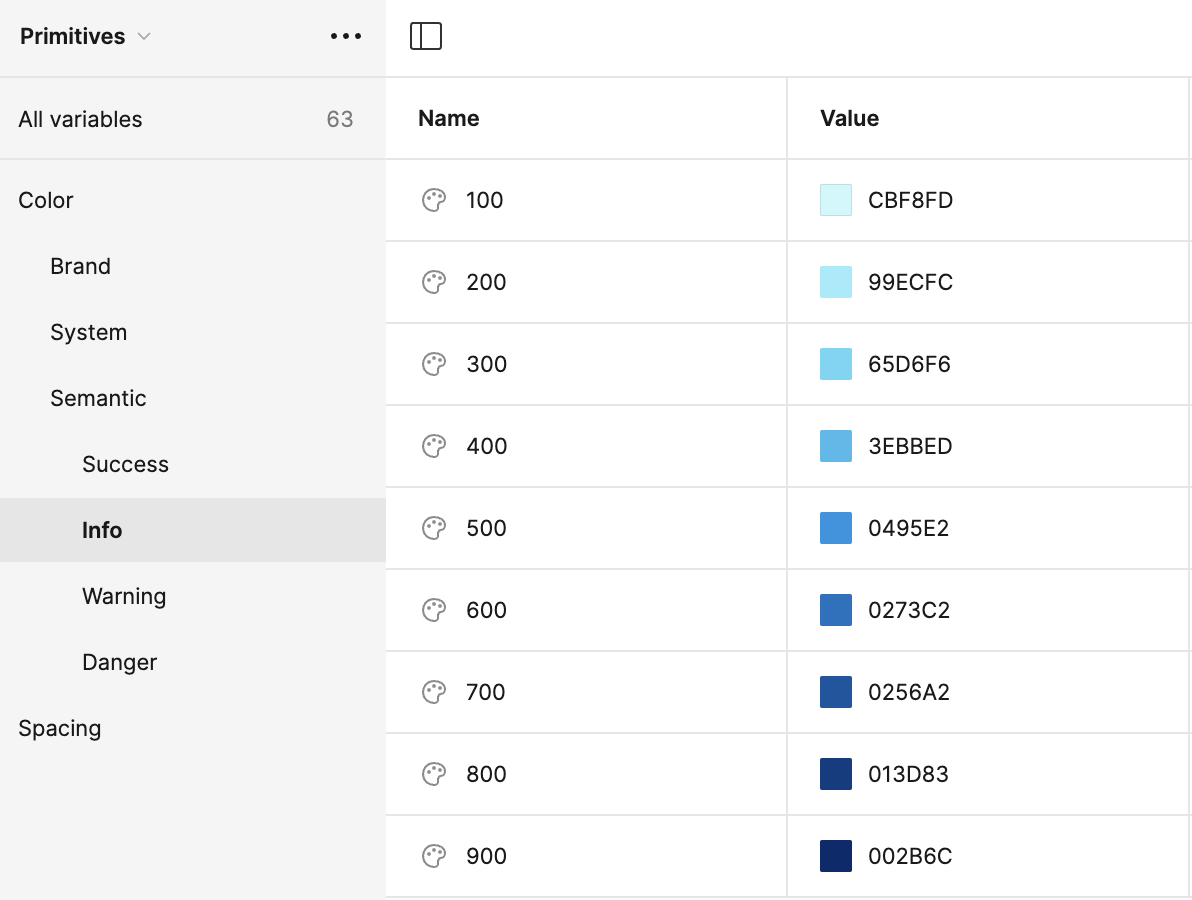
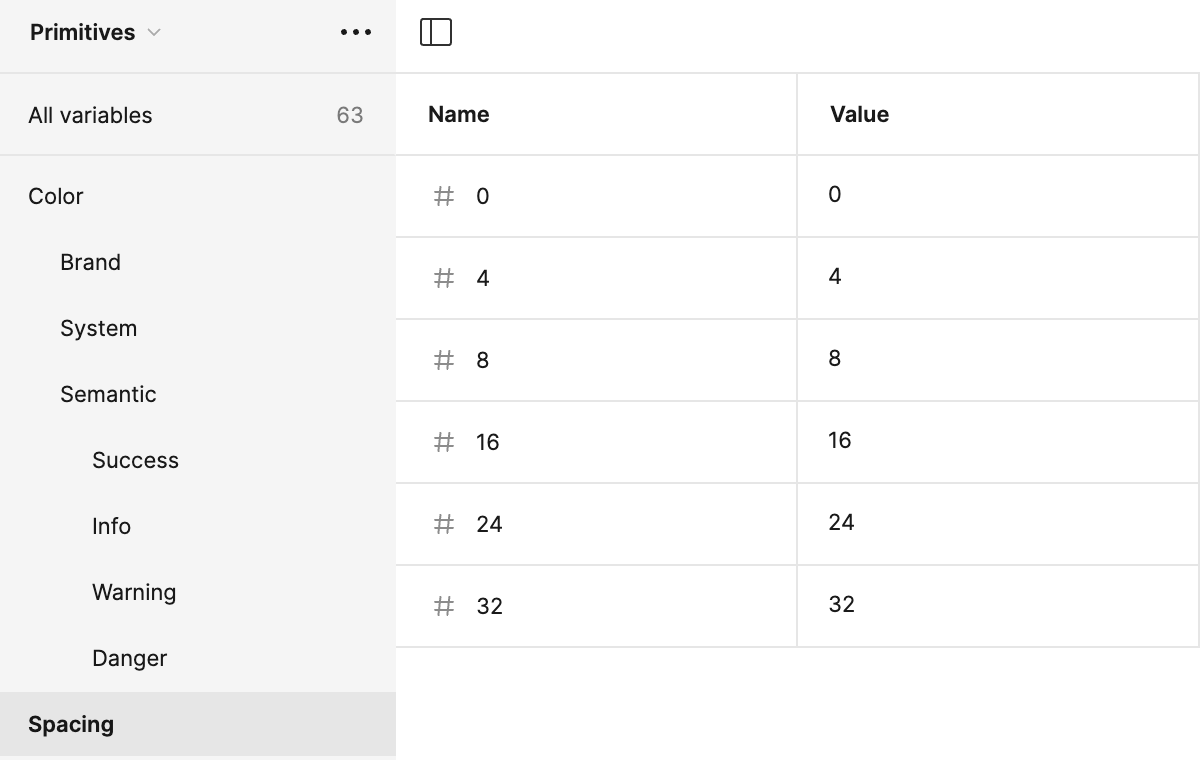
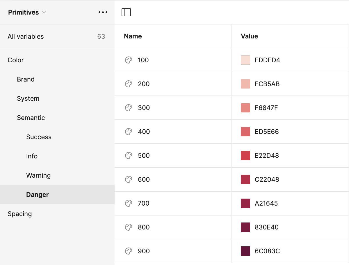
Utilizing Figma's variable system, I was able to easily make one standard design responsive to multiple different screen sizes as well as changing modes such as adding in a dark and light mode. I created variables for my design using collections: Primitives, Tokens, and Breakpoints.
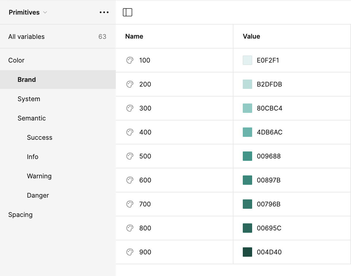
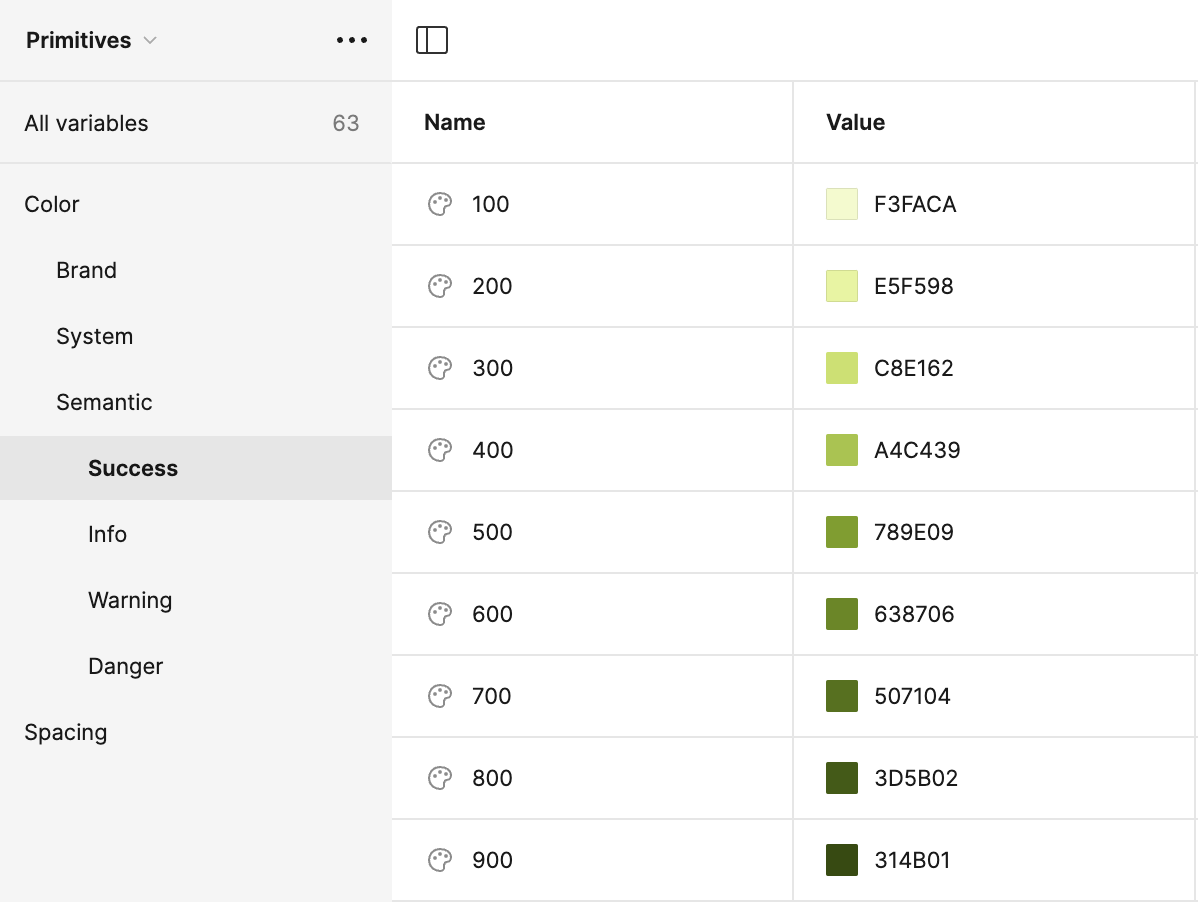
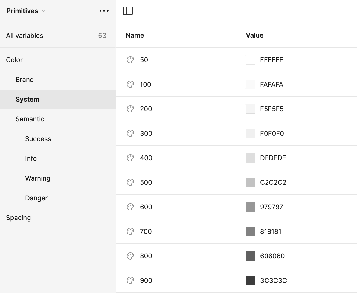
Primitives are the basic values used and serve as the building blocks for establishing a variables system. I created 3 color groups: Brand, Neutrals, and Semantics (colors associated with success, warning, error, and information).
Tokens inherit their values from primitives as listed above and are the semantic values that indicate how the primitive values should be applied.
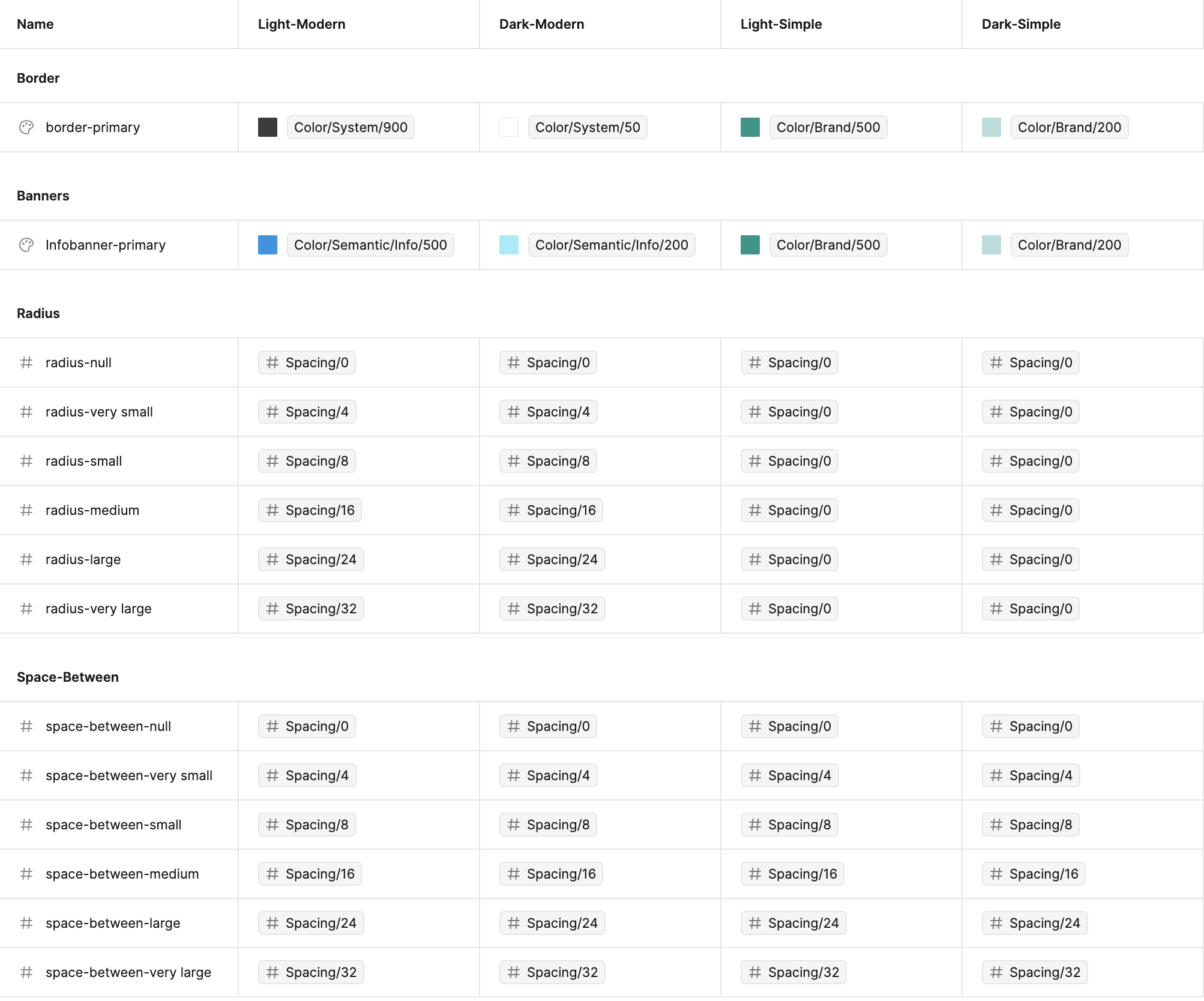
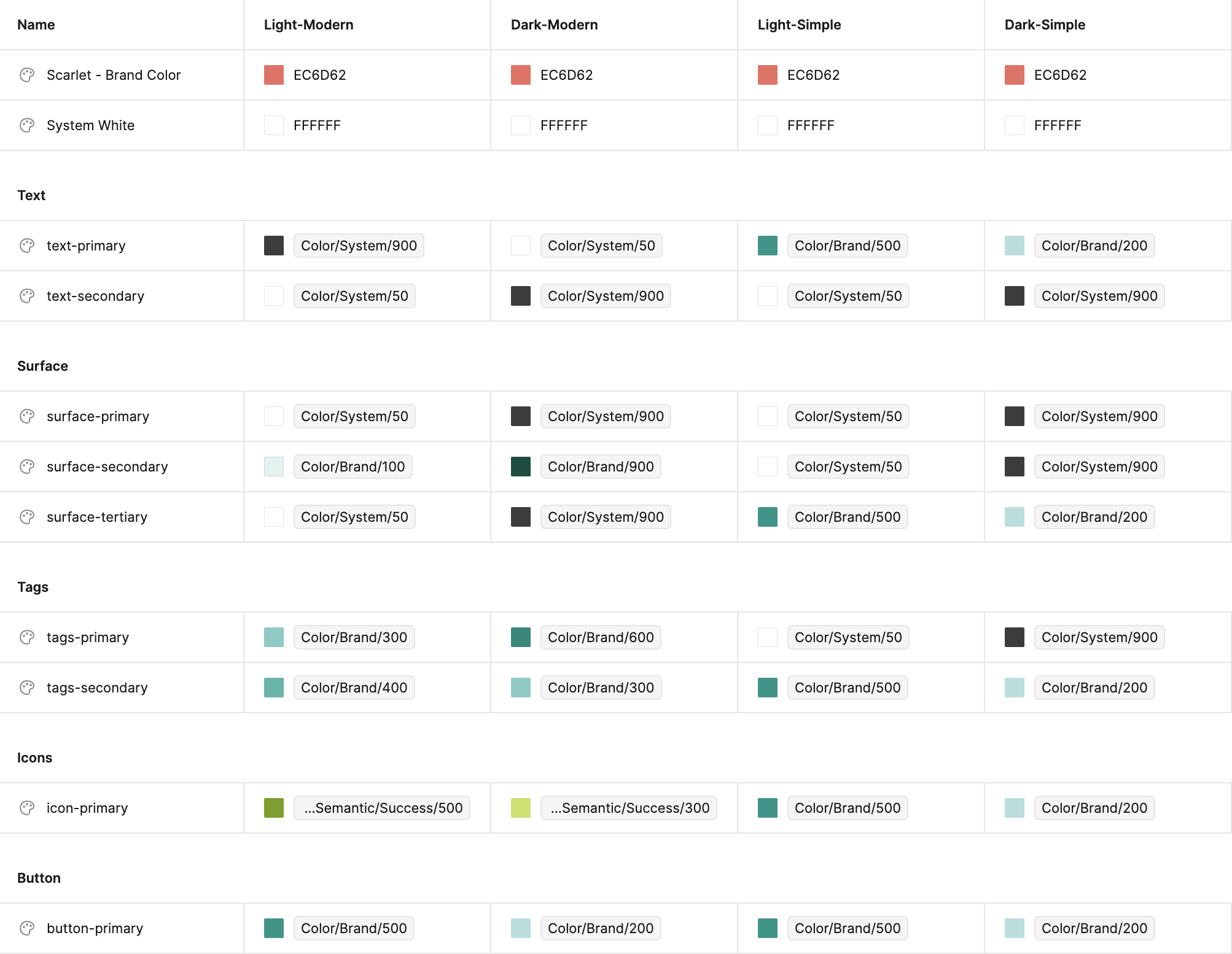
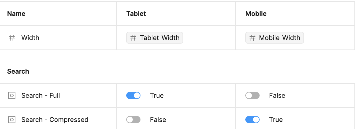
Breakpoints help to indicate how certain elements should adapt to different screen sizes which allows for a more responsive design.
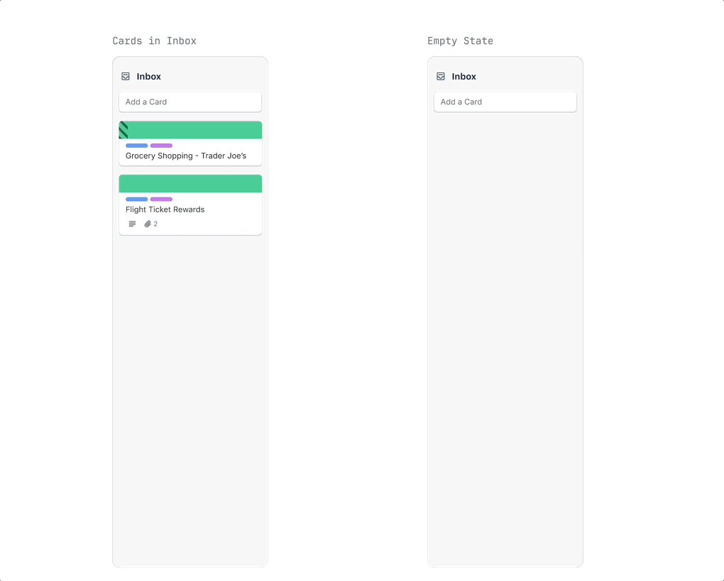
Swapping between different modes 🔁
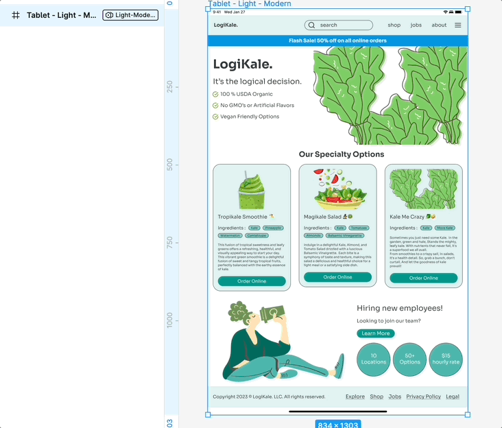
By building out a comprehensive variable system, it became easy and efficient to resize elements based on different screen sizes and change between light and dark modes as well.
Swapping between modes (Light and Dark)
Swapping between breakpoints (Mobile and Tablet)
Keeping it Organized 🧺
I also wanted to ensure that every single project file was followed consistent naming conditions so my files would be able to be handed off to developers easily.
File organization and naming conventions for developer handoff.
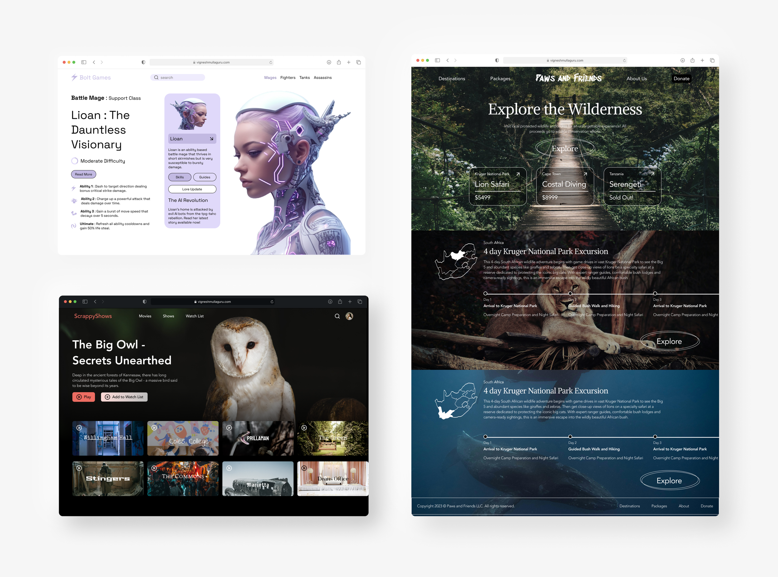
Project 2
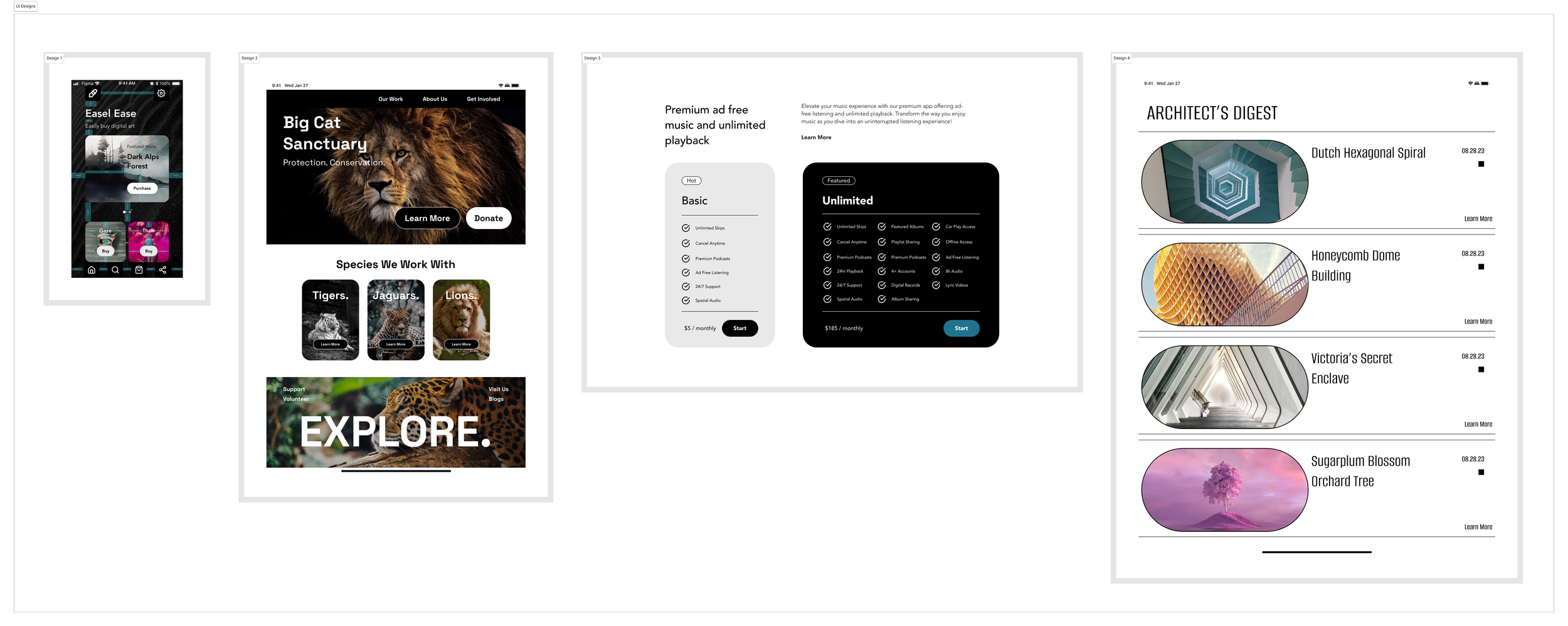
UI Designs 🎨
For this project, I designed four unique UI interfaces, each with different color and text styles. I was focused on ensuring that my designs had good file hygiene and adhered to an 8-point grid system.
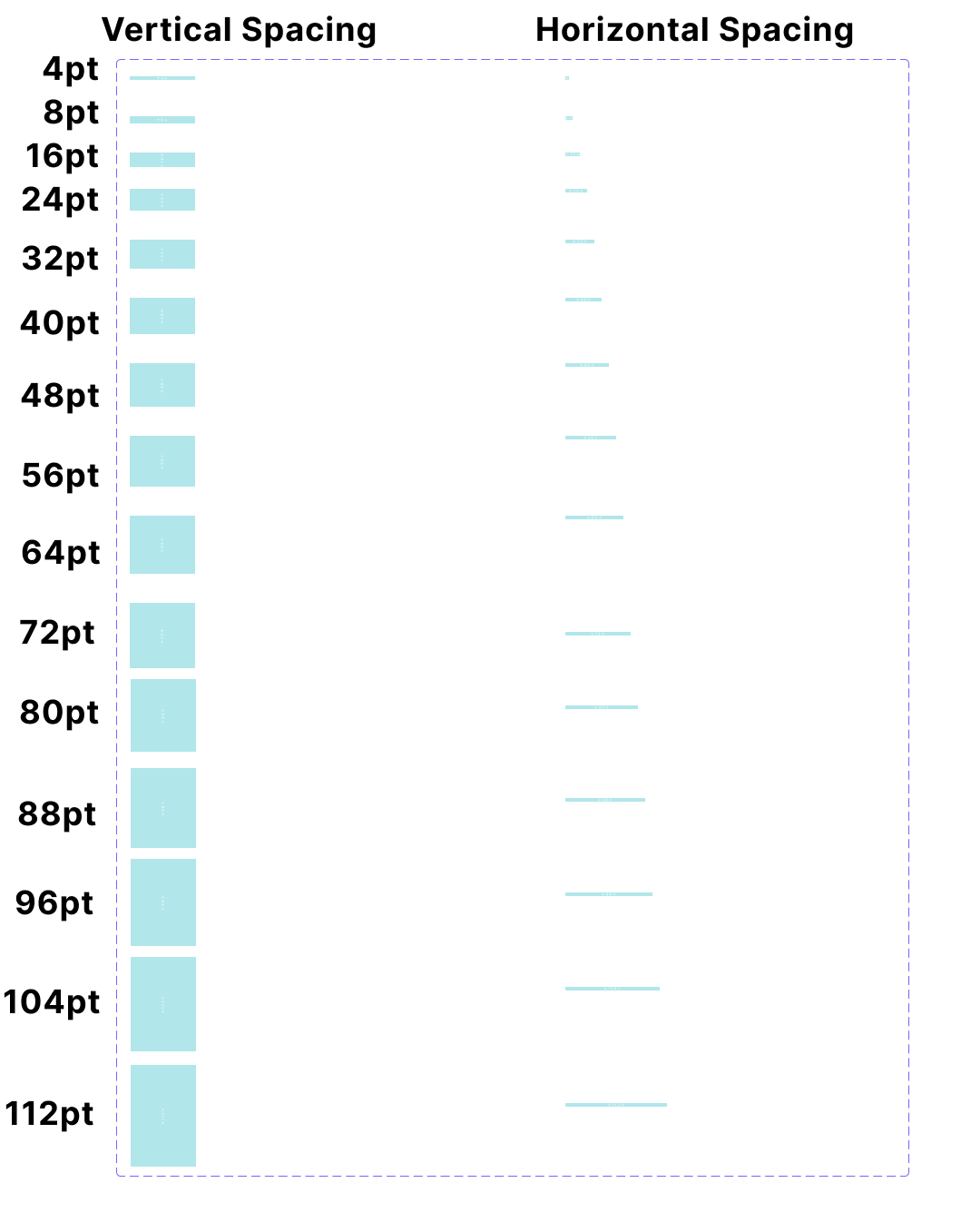
Spacing and Redlining
Keeping everything nice and tidy 🫧
In order to keep my designs consistent, I used spacers and measures following an 8-point grid system to ensure that all elements were equally spaced from each other to make sure they were visually consistent. I used redlining, which involves adding spacers to a UI design using lines to specify precise spacing and dimensions of design elements.
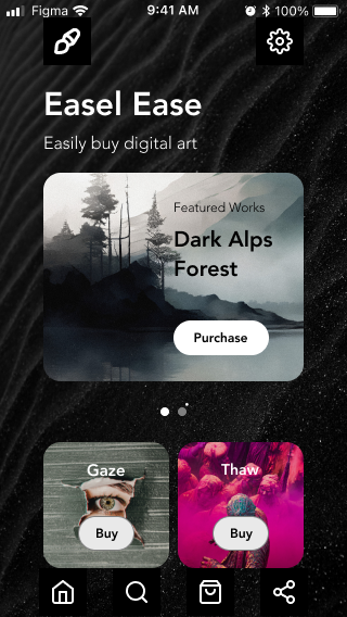
Default Design
Design with Redlining
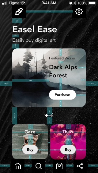
Spacer and Measures
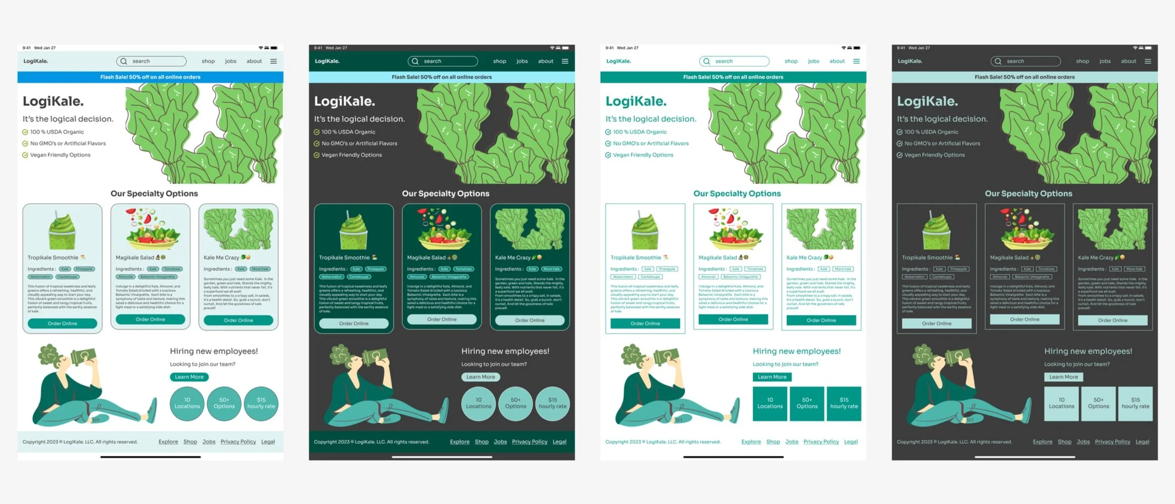
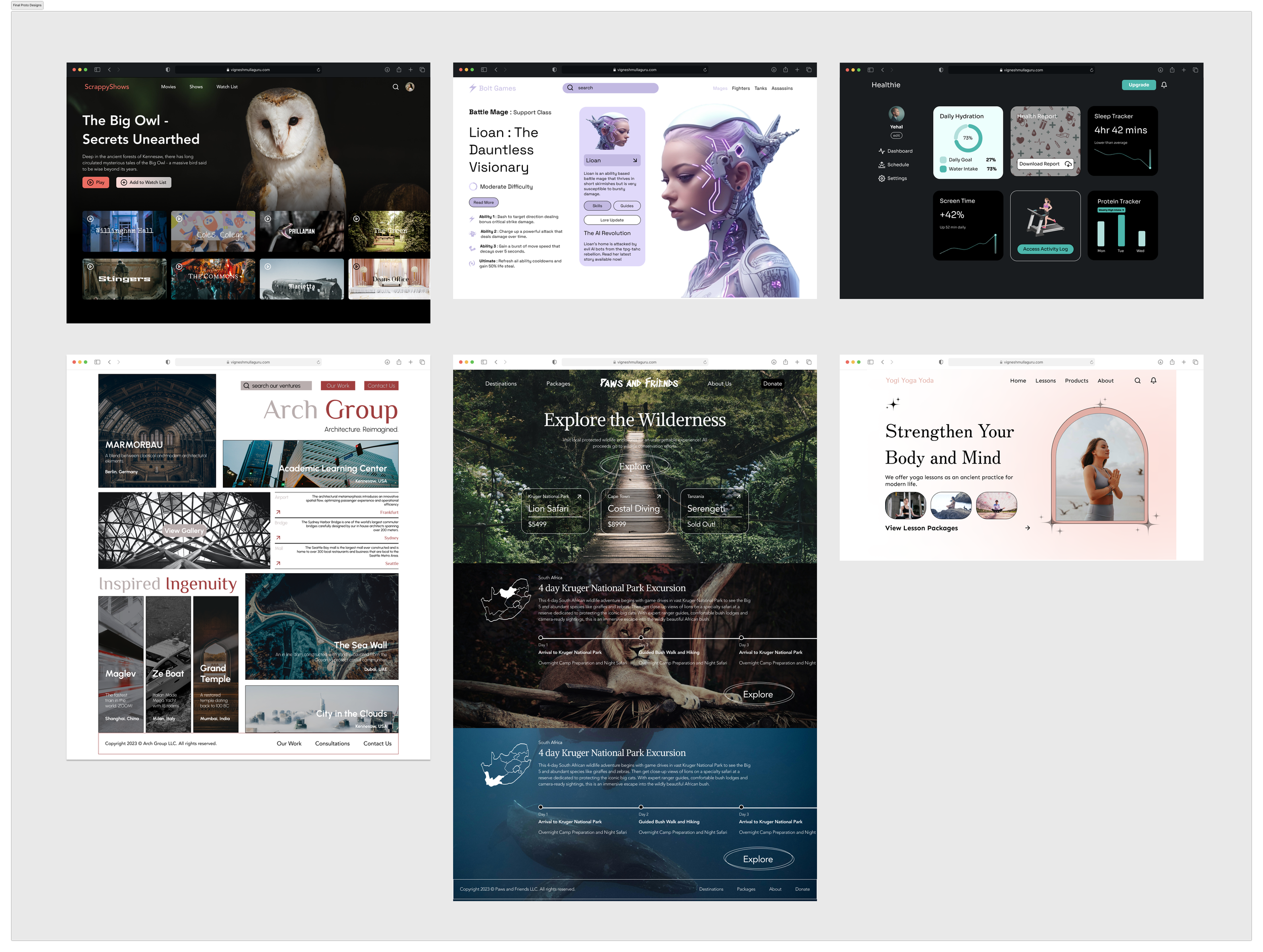
Final Project
Connecting all of the dots 🕵️
After practicing with skills such as auto layout, utilizing a variable system, and other advanced prototyping features, I created a wide range of UIs with drastically different aesthetic ranges. This final project is a culmination of all the skills that I learned from creating my first two projects.
The Magic of Components 🧱
I also ensured that all of my designs utilized components and component properties so that it would be easier to organize and structure my designs.
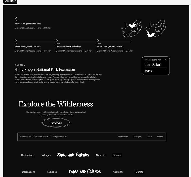
Component structure and properties for reusable design elements.
Auto Layout
Responsive Design 🎨
Auto layout is important when ensuring that designs are transferrable to different screen sizes. In all of my designs on this page, every single component has utilized auto layout.
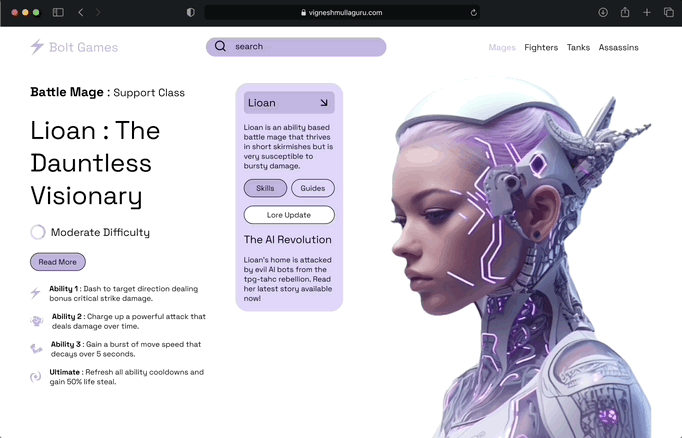
Auto layout in action for responsive components.
Final Designs
If you'd like to take a closer look, venture into my Figma file or sort through the gallery linked below.
1 / 9